Surface
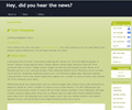

The contrasting banner helps create a solid and balanced design, whilst the use of both dark and light text and green highlights give the design a simple and friendly feel. Ideal for small businesses and blogs.
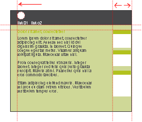


The contrasting banner helps create a solid and balanced design, whilst the use of both dark and light text and green highlights give the design a simple and friendly feel. Ideal for small businesses and blogs.

Apr | 25 | 26 | |||||
May | 27 | 28 | 29 | 30 | 1 | 2 | 3 |
May | 4 | 5 | 6 | 7 | 8 | 9 | 10 |
May | 11 | 12 | 13 | 14 | 15 | 16 | 17 |
May | 18 | 19 | 20 | 21 | 22 | 23 | 24 |